Card Sorting & Survey:
Kent State iSchool Navigation

 
iSchool-Current.jpg

Original Navigation

The original navigation for the iSchool included: Academics, Admissions, Research, Faculty & Staff, Jobs & Internships and About.

iSchool-Mock-Up.jpg

Revised Navigation

The revised iSchool navigation based on card sorting and surveys included: About, Academic Programs, Student Information & Resources, Faculty & Staff, Careers & Internships, Research and Alumni.


Determining the Need for Testing

A website is usable if it meets the needs of the intended audience through functionality, efficiency and desirability. User research was conducted to assist the iSchool in successfully meeting their key institutional objectives of recruitment and retention for Kent State University.

THE PROBLEM

The website for the iSchool is one of many tools used for both graduate student recruitment and retention at Kent State University. The iSchool’s primary objective with the website is to provide information and resources to both current and future graduate students.

User research was conducted to assist the iSchool in successfully meeting these key, institutional objectives, through data-driven decisions and designs. User research provides a thorough examination of the user’s perspective, helping us to understand the user’s goals they want to accomplish and what tasks they need to accomplish. 

The iSchool website can be made more useful by improving its information architecture.

  • It currently includes duplicate menu content under “Admissions” and “Academics” for the four academic programs.

  • This is creating a disruptive user journey pointing users to different sections of the site. 

BY THE NUMBERS

According to Google Analytics, menu links were down 35% year-over-year (YOY); and overall, the site’s pageviews were down by 39.97% YOY. The dates analyzed spanned Jan. 1, 2019 to July 4, 2019. This data suggested users were not able to successfully find the content.

NAVIGATION PRIOR TO USER RESEARCH

Initial Questions

The following questions were addressed during the study, and focused on the improvement areas.

  1. What are users looking for when they visit the iSchool website? 

  2. Where do users expect to find information on admissions for an iSchool  program? 

  3. Where do users expect to find information on an iSchool program?  

Usability Testing Goal

With the goal of the website being informational for both current and future students, ensuring that information is streamlined into the correct navigational buckets is crucial for users to successfully access this information. 

Where We Began ...

METHODOLOGY OVERVIEW

A construction worker never uses just one tool, to build a home. A doctor does not use one medical device, when conducting surgery. An artist, rarely, uses one color to construct his or her masterpiece. Why not take a singular approach? This decision is purposeful. It is to avoid being one-dimensional and incomplete. Without the support of multiple components, failure is imminent. 

RESEARCH TRIANGULATION

In user research, the same concept holds true. Multiple user research methods can be used to measure different things. They complement each other and provide separate information. Through triangulation, multiple methods can contribute to painting a clearer picture.  

According to the Nielsen Norman Group website, “The ideal way to conduct UX research is to use multiple methodologies, mixing both quantitative and qualitative research.” (Moran, 2019)

SELECTED RESEARCH METHODS

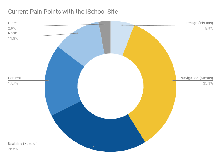
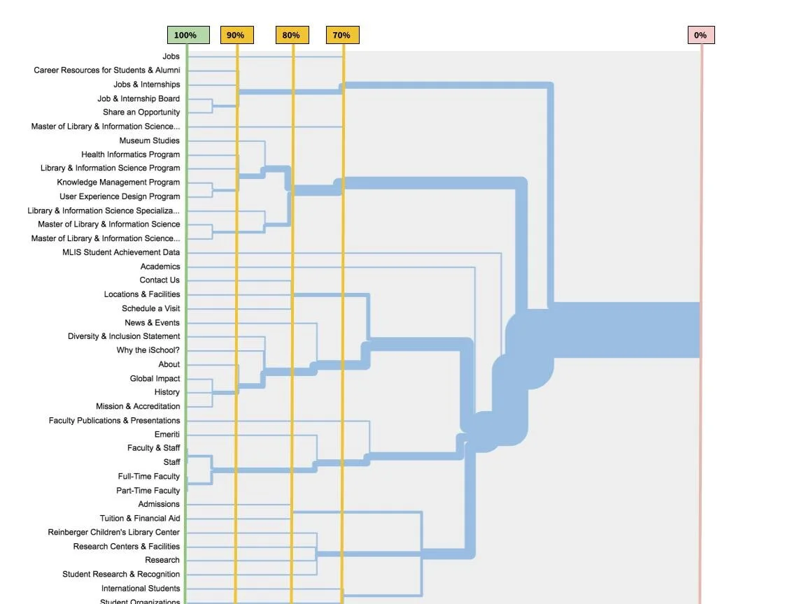
The two selected methods for this project were: surveys and card sorting - supplemented with usage data and were implemented remotely with participants.

  • The use of multiple methods provided the study with a multi-dimensional, qualitative data (non-numerical, non-categorical, non-ordinal) and quantitative data (numerical, categorical and ordinal).

  • We were able to identify what the preferred content is (survey data) and where the users prefer it live in the information architecture (card sort), through participant mental model insight for the iSchool information web space. 

Usability testing should be the next step to validate the changes made, as a result of this user research.


TARGET USER PROFILE 

The target users were representative of iSchool website end users. In order to improve the website’s information architecture, we tested it with those who interact with the site. The varying site use allowed for data segmentation. Testing with the target users  provided credible source data, which was analyzed for research-driven decisions. 

DEMOGRAPHICS

  • Gender: Male, female or gender neutral

  • College Education: Undergraduate degree completed

  • Graduate School Program: iSchool at Kent State 

  • Level of Completion (iSchool): All levels

BEHAVIORS 

  • Currently enrolled and actively participating in an iSchool graduate program

  • Has visited the iSchool website at least once

  • Has not visited the iSchool website, but plans to

TECHNOLOGY & EXPERIENCE

  • Uses the web for online learning

  • Has gone online to find information about online learning

  • Uses any of the following devices: mobile, desktop and/or tablet to access the web


ABOUT THE PARTICIPANTS

RECRUITMENT

  • Twenty-one participants were recruited from a downloaded list of active iSchool students, to ensure quality, accuracy and credibility.

  • Recruited students, who successfully completed the online participation form and screener, were selected on a first-come, first-served basis.

  • Steps were taken to guarantee participant confidentiality and data security. 

PARTICIPANTS

The sample was comprised of the following, which allowed for an inferential analysis about the population:

  • 75% females and 25% males 25%

  • 55% were first-year graduate students

  • 45% were second-year graduate students, or beyond

All participants were currently enrolled in the iSchool visited the iSchool website at least once.

INCENTIVES

Incentives ($15 Starbucks Gift Cards) were provided to qualifying participants, courtesy of University Communications and Marketing at Kent State University. Study limitations included the summer timeframe, with vacations, and remote communications.

data collection tools

  • Testing utilized Qualtrics (Survey) and Optimal Sort (Card Sort), as the data collection tools. 

  • The survey included open and closed questions to collect qualitative and quantitative data. The survey was administered to better understand the users’  interaction frequency with the website to additionally understand their current feelings about the website. 

  • The digital open, card-sorting exercise included navigational items from level one and level two of the navigation. Participants received detailed on-screen instructions before they began. During the exercise, the instructions were available for reference.

  • Participants were provided cards and were instructed to group them as they wish. There were no pre-established groups. There were 40 cards representing the first and second level navigation. Participants were asked to group the cards, based on what makes sense to them. Due to the nature of the open card-sort categories, standardization occurred to reveal the preferred groupings.

  • The survey and digital card-sorting exercise were implemented remotely.

Measurement Overview

The data was analyzed to first understand the users, through the survey, and then to better understand their actual behavior through the card-sorting exercise. The participants represented multiple class ranks and different site-use frequency, which allowed for data segmentation. 

These methods have helped to uncover insights, patterns and key findings, which have been translated into data-driven recommendations.

User research provides a thorough examination of the user’s perspective, helping us to understand the user’s goals they want to accomplish and what tasks they need to accomplish.

AREAS ANALYZED

  • Survey: Site visiting frequency, site content desired and site content pain points. 

  • Card Sort: Category agreement, card agreement groupings (high, moderate and low), and card relationships, for the best-merge method.

RESEARCH SUMMARY

SURVEY FINDINGS

SITE VISITING FREQUENCY 

Based on the survey, the site is not highly trafficked by currently enrolled students, with 50% (10) of those surveyed citing visits are limited to once or twice a year; while 35% (7) of those surveyed visit a few times a semester, and only 15% (3) of those surveyed visit on a weekly basis. None reported visiting on a daily basis. First-year graduate students are visiting the site more frequently, representing 40% (8) of the combined “weekly” and “few times a semester” reported visits. 

SITE CONTENT DESIRED

The top content the surveyed users are looking for is Programs/Curriculum Information (75%; 15), followed by Tuition and Financial Aid (10%; 2) and Scholarships (10%; 2). When combining the top ranked and second ranked content areas, Programs/Curriculum Information stands out ahead of the pack, as the primary content area desired by surveyed users. When examined by major concentration the three of the four majors responding to the survey, all reported Programs/Curriculum, as their top desired site content.

SITE CONTENT PAIN POINTS

iSchool site users surveyed are reporting trouble navigating and using the website in its current state. When visiting the iSchool website, the surveyed users noted navigation(menus) as their top pain point (35.3%; 12), followed by usability - ease of use (26.5%; 9). Surveyed users were allowed to select more than one item. Pain points appear to be consistent across class rank.

OPEN CARD-SORTING FINDINGS

CATEGORY AGREEMENT

Cards were grouped into categories named by the study participants. These categories were standardized to consolidate like names. For example: “About”, “About Us” and “Information” to avoid duplication and to better represent the card groupings by category.  

There were seven categories derived from the card-sorting exercise. The following represents the content users grouped into the categories and their agreement rates for each item.

  1. About

  2. Academic Programs

  3. Admissions & Aid

  4. Careers & Internships

  5. Faculty & Staff

  6. Student Information & Resources

  7. Research

The card groupings revealed that participants expected to see the iSchool majors under the academics section of the website, not the admissions section of the website, with all four receiving an 81% or higher category agreement rate. 

CARD AGREEMENT

Cards were also analyzed with a similarity matrix, to help identify potential groupings beyond the category agreement.  When reviewing the results of the card combinations through the card matrix, the results were broken down into three areas: high agreement, moderate agreement low agreement. 

For the purposes of this study, due to the high quality of participants (enrolled iSchool students) the cut-off score levels for card agreement groupings is as follows: high agreement cards equate to an agreement range of 100% to 90% or 40/40 agreement to 36/40 agreement; moderate agreement equates to 87.5% to 75% or  35/40 agreement to 30/40 agreement; and low agreement equates to 72.5% to 62.5% or 29/40 agreement to 25/40 agreement.

HIGH AGREEMENT CARD GROUPINGS (90-100%)

The high-agreement card groupings from the similarity matrix also reiterated the findings in the card category groupings, conveying that academic programs be grouped together, not in the admissions section. 

MODERATE AGREEMENT CARD GROUPINGS (75-87.5%)

Admissions, along with Tuition and Financial Aid were not included in the high agreement card grouping section. They appeared in the moderate agreement section, grouped together with a 77% similarity agreement. They were not grouped with any of the academic programs.

LOW AGREEMENT CARD GROUPINGS (62.5-72.5%)

The lower agreement similarity groupings reflected that of the previous two groupings, with the addition of a few cards, demonstrating consistency in agreement.

DENDROGRAM

The following dendrogram makes assumptions about larger clusters based on individual pair relationships, reflecting the best-merge method for the cards. This, too, groups the academic content for the programs together with 80% agreement, separate from the admissions content.

ischool-DENDROGRAM.jpg

Key Findings

User research provided a thorough examination of the user’s perspective, helping us to understand the audience’s goals they want to accomplish and what tasks they need to accomplish.

  • Of those surveyed, first-year graduate students visit the iSchool site most frequently.

  • Since the site is not trafficked frequently by current users, familiarity with site content may be limited, thus, requiring a strong navigation for a positive user experience.

  • Surveyed users are primarily looking for programs/curriculum information, when visiting the site.

  • iSchool site users are reporting trouble navigating and using the website in its current state - reporting navigation and usability (ease of use) as their top pain points. Pain points appear to be consistent across class rank.

  • Seven categories were created by the participants in the card-sorting exercise.

  • The card groupings revealed that participants expected to see the iSchool programs (majors) under the academics section of the website, not the admissions section of the website, with all four programs receiving an 81% or higher category agreement rate.

  • The high-agreement card groupings from the similarity matrix and dendrogram also reiterated the findings in the card category groupings, conveying that academic programs be grouped together.

    This sheds light into potential areas of opportunity, where further testing and improvements can be implemented to enhance the user experience.

Primary Recommendations

The user’s perspective provided insight into a more streamlined information architecture - prioritizing content, and identifying where there can be a reduction of content. 

It is recommended that the iSchool academic programs no longer live under both the “Admissions” and “Academics” menus, and instead live under “Academics.”  When making changes to the navigational structure of the iSchool website, it should be taken into account that the site visitors are most frequently first-year graduate students, and those visiting the site less frequently will need an intuitive, strong structure, due to non-repetitive use of the site. The high-agreement groupings, can help to guide the creation of the revised navigation, beyond the initial research questions. Consolidation and sub-groupings of the navigational structure can take place based on agreement levels as well. 

Usability was listed as a pain point by users, behind navigation. Following the navigational adjustments, additional user testing should take place to validate the changes, and to test for any additional usability issues.

Important Items to Keep in Mind


Card sorting and survey

  • Use research triangulation when possible. Using multiple research methods allows the research to measure different things. They complement each other and provide separate information that can contribute to a clearer picture.

  • Look back to look forward. Use data analytics to help guide the user research process.

  • Look beyond the UI of a research tool. Download the data and analyze it yourself, in addition to using the charts and metric analysis proprietary user interfaces provide in their tools. This will allow you to compare your findings to theirs and, perhaps, identify additional findings.

  • Data accuracy equates to credibility. Learn to identify reporting error and how to avoid it. Self-perception differs from actual behavior.

  • Know the mission. Be sure to gain a clear understanding of the client's mission.

  • Know your audience. Understanding the target user, their behaviors and the goals of the client help to inform the research process.

  • Design with research in mind. Have a good understanding of major tasks, mental models, opportunities and the like.

  • Accept feedback. Insight from outside sources can help push us beyond our personal boundaries and create the best experience for our users.

  • Don’t lead the user. Carefully craft the survey questions, and do not lead the user to collect their unique feedback.

  • Plan for the unexpected. Recruit extra participants; you never know what may come up, prohibiting them from participating. Prepare for technology glitches and the like with your equipment and supplies. Prepare to mitigate UI issues relating to card sorting — prior to launching the card sorting exercise, test the exercise yourself.

  • Always provide a clear justification for your case. Show value in your results and how it would relate to the client.

  • Save time and money. Proper research can also potentially prevent spending unnecessary dollars, dealing with unsatisfied users, extended timelines, and so forth — that is, if the issues are caught in time during the UX process.

  • Utilize incentives. If the budget allows, incorporate incentives if possible.

  • Iteration is the word. The creative process is never complete.