User Research: The ReminderX Project

Problems
The Design Challenges
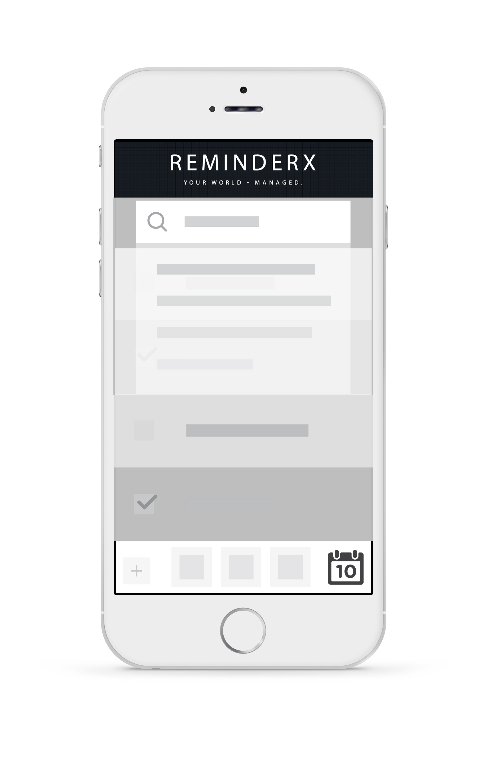
ReminderX, is a start-up software company who has built and launched a simple to-do list and reminder application for iPhone and Android phone users. The co-founders of ReminderX, Vera and Jorge expressed the need to “transform the application’s current functionality into more than a generic to-do list and reminder application.” They additionally gave permission for the team to determine the focus of upcoming releases.
Who are the current users?
Who are the target users?
What do users focus on?
What problems would the users like to be solved?
How can we solve these problems through a project redesign?
In order to address the current problem, ReminderX was looking for direction for future design iterations and enhancements. Through user research, we were determined to discover in-depth information about the application’s users - and apply that knowledge into a research-driven redesign.
BEFORE THE CHANGE: Basic original iPhone calendar view, with no ReminderX integration available.

AFTER THE CHANGE: ReminderX Calendar Integration with color coding for active (green), past due (red) and completed reminders (yellow).
Approach
The Groundwork and Foundation for Change.
Over a one-week interview period, four participants were interviewed and asked specific questions, designed to elicit their wants and needs in relation to reminders. Using this qualitative approach, the intent of the interviews was to draw out, through discussion, what their likes, challenges and goals were for creating reminders, based on their current behaviors. This type of research is meant to uncover attitudes, motivations and unconscious behaviors.
Calendar integration was a need expressed by those interviewed. Participants were using multiple methods to track reminders to calendar their items - the need for a unified approach was conveyed.
Additionally, color coding, organization and check-off lists were all recurring themes that were incorporated into this redesign.
Challenges by interview participants included forgetfulness, misplacing reminders, determining priority, out of sync methods and difficulty to gauge progress. This redesign addresses those key areas with trigger emails, segmentation based on status and/or category, with the addition of coloring items red when they are past due.
We focused on intuitive discoverability of signifiers in this redesign, to allow for a seamless transition between the previous edition and the new updated redesign. The mapping of the redesign was also a key focus to allow for a successful user experience. The user receives feedback during the verification process and continually via the email triggers. The User Experience for the ReminderX product is enhanced, innovative, intuitive, empowering, collaborative and dependable.
Formative testing was conducted to examine the effectiveness of the preliminary design concepts. This testing purpose was to validate the design of the ReminderX application and to provide insight into the approach and focus of future design iterations.
Testing provided feedback on terminology, organization, functionality and navigability. Additionally, this testing uncovered the users’ understanding of the product purpose and determined its value.
- Usability testing was conducted for the new ReminderX application with four participants (two female and two male), who currently utilize a reminder application and have the goal to be organized.
- All participants are employed, lead busy lives and range in ages (and skill levels) from 19 to 43.
- A paper prototype was used in both the in-person and remote testing sessions. All sessions were recorded.
Based on user responses during the test, scoring was averaged using a scaled methodology and then measured in order to create a quantitative summary. Based on user responses, open-ended fields were analyzed for trends to see if they conveyed the design was meeting its objective - or if it was needing a change.
Based on this information, this redesign prototype uses the persona of “Ben” - who is using the newly enhanced ReminderX application to integrate his reminders on his iCal from his iPhone. This workflow is meant to satisfy Ben’s need to be organized and collaborative if need be, with a simple workflow solution.
VALIDATE the navigational structure for creating a calendar integration reminder.
VALIDATE the prioritization of information presented on the detailed pages.
DETERMINE the overall validation preference when comparing multiple options.
ESTABLISH whether participants noticed a missing component to the design,
enjoyed their experience and/or encountered frustrations with the design.
Results
What the testing showed.
Based on the four usability testing sessions, the following information was gathered.
Scoring was measured using a scale of 3 to 1, with 3 equating to the user "completing the task using the desired method"; 2 equating to the user "completing the task in a roundabout way"; and 1 equating to the user as being "unsuccessful - could not complete the task."
All open-ended questions were measured qualitatively, looking for trends and feedback, relevant to the projects primary goals. All feedback was noted.

Due to the fact that 9% of tasks were not completed using the desired method (score: 17 out of 179), iterations are thus required to improve, especially the 6% of that total who did not completed specific tasks successfully at all. (Score: 11 out of 179)
91% of all scored testing answers were completed using the desired method. (Score: 162 out of 179)
3% of all scored testing answers were completed using a roundabout method. (Score: 6 out of 179)
6% of all scored testing answers were completed unsuccessfully. (Score: 11 out of 179)
Participants like the application and all said they would be likely to use it in the future.
Changes will need to be made to the categories above, based on the unsuccessful testing scores and will be prioritized.
- Reminder completion will need to be revisited.
- The application view will need to be reworked.
- The category selection will need to be evaluated.
- Users liked the flexibility for intense users and simple users according to feedback during testing sessions.
- Users liked that they were able to see which task was active and sub-categories for monitoring their hectic lives.
- Users felt it was a familiar interface and comfortable.
- Users liked the ability to filter, sort and sync calendars.
- Users would like the ability to create alerts that a reminder is not only past due, but coming up soon.
- Users would like less focus on the email alerts, but in application alerts and text alerts.
- Users would like more attention to edit and delete buttons in the reminder itself.
- Re-evaluate the filter buttons on the bottom, caused some confusion as an option for completion.
- Examine options for completion - radio buttons are not preferred by one user in mobile due to the need to be exact.
- When scrolling, freezing the reminder name at the top is preferred.
- Email invitations and application notifications are preferred, in addition to invitations showing on the invitee’s calendar.
Users could not successfully complete the reminder, this item will be revisited and re-tested.
The application view will need adjustments in its organization to show unscheduled last, and was missing items such as the edit button, and additional filters (pending acceptance).
Some users struggled with the drop-down category option. This will need to be reviewed.
To scroll through wireframe images, click the last image once. There are a total of four images pictured below.

Lessons Learned
Change is the only constant.
Data accuracy equates to credibility. Learn to identify reporting error and how to avoid it. Self-perception differs from actual behavior.
Design with research in mind. Have a good understanding of major tasks, mental models, opportunities and the like.
Know the mission. Be sure to gain a clear understanding of the client's mission.
Accept feedback. Insight from outside sources can help push us beyond our personal boundaries and create the best experience for our users.
Do not lead the user. While we want the answer to be correct, we want the user to find the answer on their own.
Plan for the unexpected. Recruit extra participants; you never know what may come up, prohibiting them from participating. Prepare for technology glitches and the like with your equipment and supplies.
Always provide a clear justification for your case. Show value in your results and how it would relate to the client.
Save time and money. Proper research can also potentially prevent spending unnecessary dollars, dealing with unsatisfied users, extended timelines, and so forth — that is, if the issues are caught in time during the UX process.
Iteration is the word. The creative process is never complete.