Testing Scores Drive Change
Based on the four usability testing sessions, the following information was gathered.
Scoring was measured using a scale of 3 to 1, with 3 equating to the user "completing the task using the desired method"; 2 equating to the user "completing the task in a roundabout way"; and 1 equating to the user as being "unsuccessful - could not complete the task."
All open-ended questions were measured qualitatively, looking for trends and feedback, relevant to the projects primary goals. All feedback was noted.
TASK SCORING
Due to the fact that 9% of tasks were not completed using the desired method (score: 17 out of 179), iterations are thus required to improve, especially the 6% of that total who did not completed specific tasks successfully at all. (Score: 11 out of 179)
91% of all scored testing answers were completed using the desired method. (Score: 162 out of 179)
3% of all scored testing answers were completed using a roundabout method. (Score: 6 out of 179)
6% of all scored testing answers were completed unsuccessfully. (Score: 11 out of 179)
Participants like the application and all said they would be likely to use it in the future.
Changes will need to be made to the categories above, based on the unsuccessful testing scores and will be prioritized.
What is Going to be Done
IMMEDIATE ACTION
- Reminder completion will need to be revisited.
- The application view will need to be reworked.
- The category selection will need to be evaluated.
POSITIVE FEEDBACK
- Users liked the flexibility for intense users and simple users according to feedback during testing sessions.
- Users liked that they were able to see which task was active and sub-categories for monitoring their hectic lives.
- Users felt it was a familiar interface and comfortable.
- Users liked the ability to filter, sort and sync calendars.
FUTURE IMPROVEMENTS
- Users would like the ability to create alerts that a reminder is not only past due, but coming up soon.
- Users would like less focus on the email alerts, but in application alerts and text alerts.
- Users would like more attention to edit and delete buttons in the reminder itself.
- Re-evaluate the filter buttons on the bottom, caused some confusion as an option for completion.
- Examine options for completion - radio buttons are not preferred by one user in mobile due to the need to be exact.
- When scrolling, freezing the reminder name at the top is preferred.
- Email invitations and application notifications are preferred, in addition to invitations showing on the invitee’s calendar.
Why the Changes?
CREATING A REMINDER
Users could not successfully complete the reminder, this item will be revisited and re-tested.
CALENDAR INTEGRATION & VALIDATION
The application view will need adjustments in its organization to show unscheduled last, and was missing items such as the edit button, and additional filters (pending acceptance).
ORGANIZATION
Some users struggled with the drop-down category option. This will need to be reviewed.
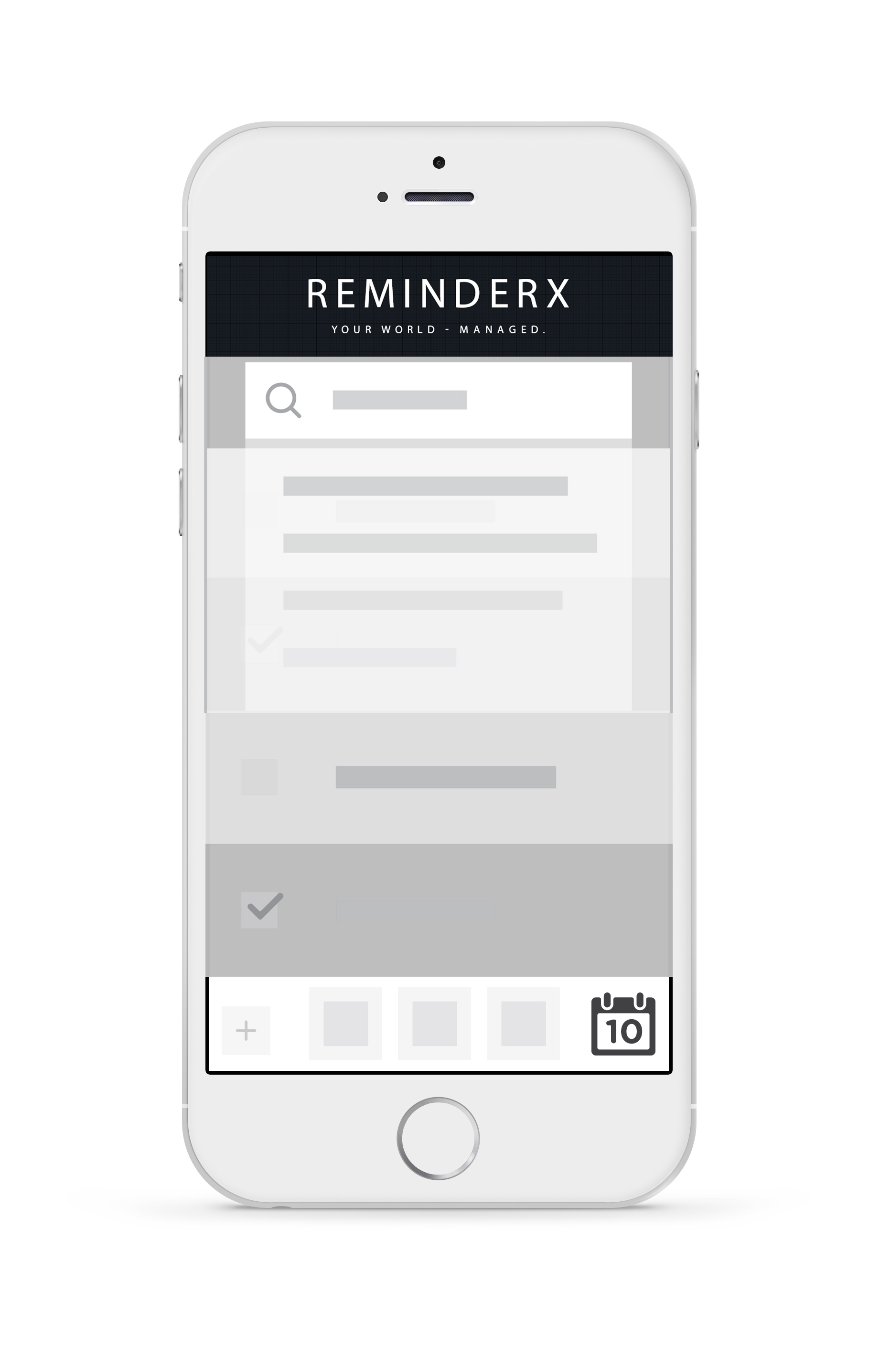
Wireframe ReminderX Design Iterations
To scroll through wireframe images, click the last image once. There are a total of four images pictured below.


